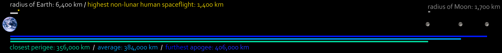
Space is so huge, and so empty, that diagrams showing the Solar System, or the Earth and the Moon, often show the objects at a far larger scale than the distances between them. This image shows the Earth–Moon system to scale, with every pixel on the full-size image representing about 220 km. The Moon’ s orbit is not a perfect circle, with the result that it is sometimes closer, and sometimes further away from Earth. In fact, it looks around 14% larger and 30% brighter when at its closest to the Earth, known as perigee, than when at its furthest, which astronomers call apogee.
Most amazing is quite how feeble the extent of human spaceflight is when seen on this scale: with the exception of the Moon missions, the furthest people have been into space is represented by the stubby yellow line, less than the radius of the Moon. We’ve sent probes into the Solar System, and even into deep space, and have a few satellites just over a tenth of the way to the Moon—but actual humans have never been higher than 1,380 km. To paraphrase the page which inspired this diagram: of all the humans who have existed since the dawn of history, only 24 have ventured further than that tiny shell around our home planet. Seeing this to scale only makes the Moon landings more incredible.
Further reading:
- Inconstant Moon
- Lunar perigee and apogee calculator (aka Supermoon calculator!)
- Super Full Moon from NASA
- Wikipedia’s list of spaceflight records