Someone in my office (ie a physicist with no desire to be an administrator—it’s the best thing about the kind of office I work in) leaned over to me this morning: ‘What’s a Gantt chart?’ he asked.
It’s an answer I never look forward to delivering. I’d rather field ‘Daddy, where do babies come from?’ than this one. People don’t ask what a Gantt chart is unless they need to know, and if they need to know, it means that they may be drawing one in the not-too-distant future. There is little which can soothe the pain they are about to experience. Every time another person learns about Gantt charts, a fairy dies. The only people who might not feel like a small part of their soul has been snatched upon learning what a Gantt chart is are soulless bureaucrats, whom I make a point of avoiding.
A Gantt chart is part of the armoury of the Evil Generic Corporate Bureaucrat; other weapons of war include the acrostic-tastic ‘Together Everyone Achieves More’ (I always preferred ‘Together We Achieve Targets’, myself), books of tips for achieving the perfect ‘work–life balance’ and the requirement that staff set themselves OKRs—Objectives and Key Results—at the start of every quarter (a unit of time only used in the business sector—in fact, the only unit of time recognised by executives except ‘On my desk, NOW!!!’).
I hate Gantt charts (can you tell?). They involve (be aware that a fairy will die if you read any further) drawing a horizontal axis, representing the timescale of a project and, below that, a series of blocks, drawn in rows, whose horizontal extent represents how long you think they will take. In case it’s not obvious, this is a total waste of time. The project you draw up, unless you’ve already done one very similar before (in which case, why are you drawing a Gantt chart?) will bear no resemblance to the project you then carry out. The more complicated the estimation process, the longer it takes, and the less likely you are to get it right. By week seven, the Gantt chart will not tell you what it is you’re actually doing unless you had the foresight to draw it on a very stretchy rubber sheet.
Here is an example of a Gantt chart:
| week | 1 | 2 | 3 | 4 | 5 | 6 | 7 | 8 |
|---|---|---|---|---|---|---|---|---|
| tasks | waste time making Gantt chart | |||||||
| do project (badly) | ||||||||
Want my advice? Head for the hills while you still can:
| week | 1 | 2 | 3 | 4 | 5 | 6 | 7 | 8 |
|---|---|---|---|---|---|---|---|---|
| tasks | head for hills | |||||||
| stay in hills | ||||||||
ARRGH!!
See? It’s catching.
But it gets worse. There’s another diagram I found out about today: it’s called the Deming Wheel. Here goes another fairy:
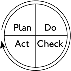
‘Plan, do, check, act,’ it implores! And, what’s even better is that you can enter the circle at any stage and still have a viable cycle. I will leave that as an exercise for the reader to corporate bullshit their way out of, because that isn’t the most important fact about the Deming Wheel. The important bit is that it’s circular. It never ends.
True, it doesn’t matter where you jump in, but the careless will be too excited by its appealing management-speak elegance to notice that there are no emergency exits located anywhere in the Evil Deming Vortex of Infinite Infinity. You just keep going, like a little hamster in a suit and tie, running, panting, squeaking as loud as your little hamster–middle-management lungs will allow, eternally round and round and round the Deming Wheel.
Suddenly, the evil Gantt chart doesn’t look so evil after all. Waste of time though it may be, it’s linear and, at some point well after the originally-planned deadline, you’ll drop off the end into blissful aims-and-objectives-free normality once more. The only escape from the Deming Wheel is the sweet release of death:
| week | 1 | 2 | 3 | 4 | 5 | 6 | 7 | 8 |
|---|---|---|---|---|---|---|---|---|
| tasks | plan, do, check, act, plan, do, check, act… | |||||||
| sweet release of death | ||||||||
In my day, we just called that a schedule.
OKR is a bad acronym? Ahaha, you haven’t even conceived of the depths to which the HR department of [well-known energy company for which I work] plummets. Our objective setting system is called AMP, which while all very confusing for someone who works with electricity most of the time, actually stands for “Achieving My Potential”. Trust me, the ball-achingly anodyne statements that must be put on the system would not achieve the potential of a ping-pong ball.
Sample: “I will create synergies with the customer to deliver timely solutions that match up to their expectations.” Or something like that.
PS. In comparison, the two-A3-page Gantt chart which documents the progress of our climate change project with the Met Office is quite cuddly and useful…
Poor Clym…unfortunately, you have to play the game and fill out those forms, and use those acronyms ( if you’re clever enough you can appear to be doing so, whilst really laughing up your sleeve) but ultimately, you have to ask whether thats a legitimate way to spend your life (you only get the one you see). Dn’t spend too long pondering; as soon as the novelty wears off, find something more interesting to do (given the level of cynicism you’re displaying after what, 3 months?) I don’t think that’ll be too long…..
And for Andrew…there’s a fortune to be made by the man who invents a better mouse trap (or so the saying goes) and maybe there’s a fortune to be made by the man who shows the world a better way to plan long and complex projects than using Gannt charts….go to it my son…